Touchscreens Update1
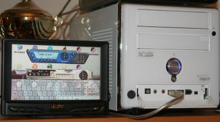
For now, the 10.4" touchscreen is being tested on my Intel Mac Mini in my bedroom, and the 7" touchscreen on my HTPC as a second display/control interface out in the living room. I am still experimenting with both setups and they are very much WIP, but have made some interesting discoveries in the process.
10.4" TOUCHSCREEN
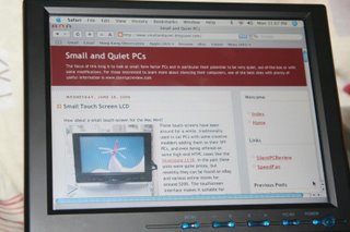
Previously I had my Mini attached to a 27" TV set in my bedroom which was fine for watching DVDs, Applestore videos, viewing photos, and even some light internet browsing. However anything that involved more substantial reading was a little hard on the eyes (text is never too sharp using composite video although OS X's browser does allows web page font text to be enlarged very easily).
Switching to the touchscreen did mean a trade-off as viewing video on a 10.4" LCD certainly cannot compare with a 27" CRT TV, however there were quite a few advantages to speak of. With the touchscreen on my lap, it became much easier to navigate using my finger than having to drag a mouse on my bedsheets. In fact using a touchscreen was so easy that even an 11 month-old child had no problem interacting with a children's program designed for a significantly older age group (with all the saliva being applied in the process, that also meant the screen needed a good cleaning afterwards).
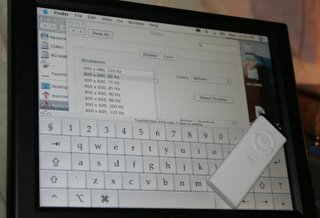 Even typing on an onscreen keyboard worked quite well and could be done quickly. With the keyboard set wide enough, there is enough room to place both hands on it similar to touch typing on a real keyboard (the Apple remote is shown for scale). However because of it's smaller size and without being able to feel the keys, you do have to keep your eyes on the screen.
INPUT DEVICE OF THE FUTURE?
The keyboard shown above is Touchstrokes for OS X from Assistiveware.com is a little pricey at $59; actually Assistiveware has an even more expensive version for $299 called Keystrokes which offers additional features like predictive typing (typing just the first few letters will cause a row of common words/phrases to be displayed which can be selected simply by touching the desired word) and audio feedback of what is being typed (reading out the letter or word). This software is targeted at people with disabilities or injuries requiring alternate input methods, however such functionality might one day lead to a tool superior to the keyboard/mouse combo for normal PC use?
Let's try to imagine, instead of the keyboard and mouse you most likely have in front of you now, you have a flat lcd-like panel slightly longer than your current keyboard and twice as deep, angled up slightly towards you Let's call this the "Input Panel" (this is just an input device, your primary display is still the same screen you are using).
Using your finger you draw a circle on the dark Input Panel which causes your computer to turn on and the Input Panel to light up displaying an array of customized shortcut buttons for one-touch access to your common apps (think Optimus mini three) . Everything can be customized to your prefence, the layout and appearance of the background and the buttons depending on your fancy. The Windows task bar parks itself at the very top (or bottom) of the Input Panel.
Launch your favorite app by touching the appropriate button, or alternatively by using your finger to draw a symbol, maybe a $ to launch your accounting package, the outline of an envelope to launch Outlook, B for browser, whatever your preference (think Strokeit mouse gestures utility). As soon as your application launches, the Input panel image dynamically changes tailoring itself to the application.
For wordprocessing, the image of a keyboard appears on the bottom half of the panel. Again the look and layout customized to your taste, whether skinned, animated, colored, fonted, etc. (think Optimus keyboard). As you begin typing the very first characters, the most common words and phrases starting with these characters (based on your typing habits) will be displayed on the Input Panel just above the keyboard. Simply moving your finger up to touch the appropriate word will select it, or you may choose to ignore them for the shorter words (think Keystrokes). A Display Window on the upper half of the Input Panel will display the most recent lines of text as you type, basically mirroring the selected region on your main display. Need to delete the last word, simply draw a back arrow over the keyboard with your finger, or select certain text simply by dragging your finger over where it's displayed in the Display Window. Need to move the focus of the display window to a different area of the document, simply put your finger on the virtual navigation button and drag it in whichever direction you wish to scroll.
Worried about tactile/sensory feedback? There are a small row of tiny bumps where the ASDF JKL; keys appear, too small to obscure the display, but just big enough to feel so the fingers know where to rest for touch-typists. The surface of the Input Panel could also be produced with the right amount of resistance/play that pushing down would provide the necessary feedback.
For games, no need to remember all the different keys/commands or worry about hitting the wrong buttons at the worst times. Only gaming keys will be displayed, with the symbols, words, color-coding that allow them to be quickly and easily located (think Zboard gaming keyboard). Pertinent gaming information like score, ammo count, communication windows, etc would be displayed on the upper half of the Input Panel allowing more screen space for displaying your virtual environment (think Logitech gaming keyboard).
For image editing apps like Photoshop, all the toolbars are displayed on the lower half of the Input Panel. The top half would be a dedicated display window/touch tablet focusing on the area being edited (think Wacom Cintiq sans pen). Alternatively switch to album mode where a collection of photos appear scattered across the Input Panel. They can be arranged, rotated, resized, labeled simply by using the fingers (think Multi-touch Interaction Research demo).
I'm sure many people have already seen this demo by Jeff Han from NYU that has been out for about four months, but I only happened upon this video during my recent search for touchscreen interfaces. I was extremely impressed by this demo (don't forget to push play in the Quicktime window or alternatively view it on Youtube.com), it brought back images of Keanu Reeves in Johnny Mnemonic or more recently the UI in Minority Report.
Digging a little deeper, it seems many of the user interface ideas are actually not new and there have been researched/projects into this before. Edward Tse at University of Calgary studied applying a similar interface to Warfcraft as well as interacting with Google World as demonstrated in this Google video.
Andrew Wilson from Microsoft's Adaptive Systems and Interactions group demonstrates another earlier multi-touch technology TouchLight demo (wmv) as well as a very cool PlayAnywhere demo (wmv).
And last but not least, some novel application of touch technology currently available for the entertainment sector, www.fogscreen.com - demo (wmv) and www.i-bar.ch - demo. . . . ok getting back to my own touchscreens. . .
MINOR ANNOYANCES
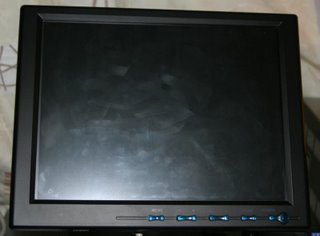 The vga, usb, and power wires dangling from the screen are somewhat messy, but they never got in the way during use. Fingerprints and streak marks leaves the screen aesthetically unpleasant, but this is not noticable when the display is on. The flash slightly exaggerates the marks in the photo.
OS X vs WINDOWS
The touchscreen drivers supplied with my Lilliput screens do not support the Intel version of OS X and initially I was unable to get it to work. However thanks to www.mp3car.com forums I learned that a Beta version was available at www.egalax.com.tw, which I assume is the actual manufacturer of the touchscreen controller. The configuration options are significantly less than the Windows version, however it allowed the touchscreen to function without issue.
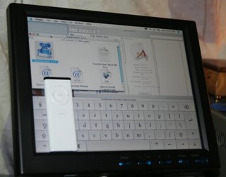 OS X normally has an easy-to-use user interface, but I will have to say it's not as touchscreen-friendly as Windows or maybe I'm just not familar enough with it to know where to make the necessary tweaks. Scrollbars, menu bars, and buttons tend to be quite small in OS X, and although still accessible with a finger, requires more precision and retries.
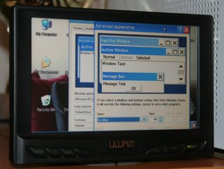 Windows on the other hand allows you to customize the appearance of the interface making things like scrollbars as wide as you like so even people with large fingers would have no problem.
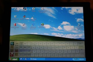 Windows XP also comes with an onscreen keyboard, however it is a little small if you plan to type more than a few words. Here is the Jitbit Virtual Keyboard which can be purchased for $12 and can also be made transparent.
Screen-resolution-wise, the native 800x600 looked best both in OSX and XP, however 1024x768 was also acceptable; at this resolution text appeared a little clearer in OSX, possibly better font smoothing, but there were a few rogue lines in the lower right of the display not to be found under XP.
7" WIDE-TOUCHSCREEN
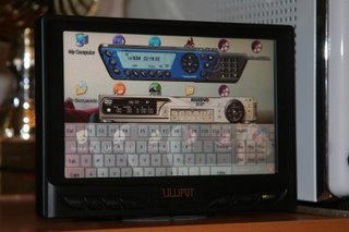
Using the second onboard VGA connector from my AOpen EZ18 SFF (nforce2 chipset), I had no problems adding a custom resolution of 800 x 480 (screen's native resolution). Using Nvidia's Nview, the system happily drove both displays, keeping my main plasma display at 1280x768. My thinking is to have all icons, menus, control bars, taskbars, etc. displayed on the 7" touchscreen, while the video/images would be displayed on the main plasma screen. Any adjustments, manipulations, settings could be performed on the touchscreen without disturbing the video on the main display.
One problem I discovered was that Windows XP was not made to run on a screen with 480 vertical resolution. Many of the configuration windows, popup dialog boxes, etc. were simply too tall that they extended off the top/bottom of the screen; unfortunately critical buttons like NEXT, APPLY, CANCEL, etc tend to be located at the bottom of such dialog boxes.
 Setting up another custom resolution of 1000x600 solved this problem (this photo). It's not the native resolution, but all text/images looked just as nice even above the screen's native 800x480 resolution (unlike the 10.4"). Possibly because of it's smaller pixel-size or better anti-aliasing in the 7" model.
The application control panel does shrink respectively, and some of the smaller buttons can be more difficult to touch using a finger. Possibly getting some skins with larger sized buttons would help. Alternatively there are a lot of nice car front ends with big easy to access interface like Streetdeck or RoadRunner that could possibly be tailored for HTPC use.
I did have a lot of trouble getting the video window/control interface to automatically open up on the correct display upon launch (video window maximized on primary display and control interface on touchscreen); this was with PowerDVD and ComproTV. Further for PowerDVD, even with the video window maximized in the main display, it would tend to launch the video at a reduced size (assume it defaults to the resolution of the touchscreen where the application was launched). Certainly there must be HTPC applications with better multi-display support? MCE?
Otherwise if I don't find enough apps which support dual-display then there's the option to setup the touchscreen to clone the main display, but that wouldn't be as ideal. Any comments from users with dual-display/touchscreen experience is welcome.
Back to Small Touch Screen LCD

0 Comments:
Post a Comment
<< Home